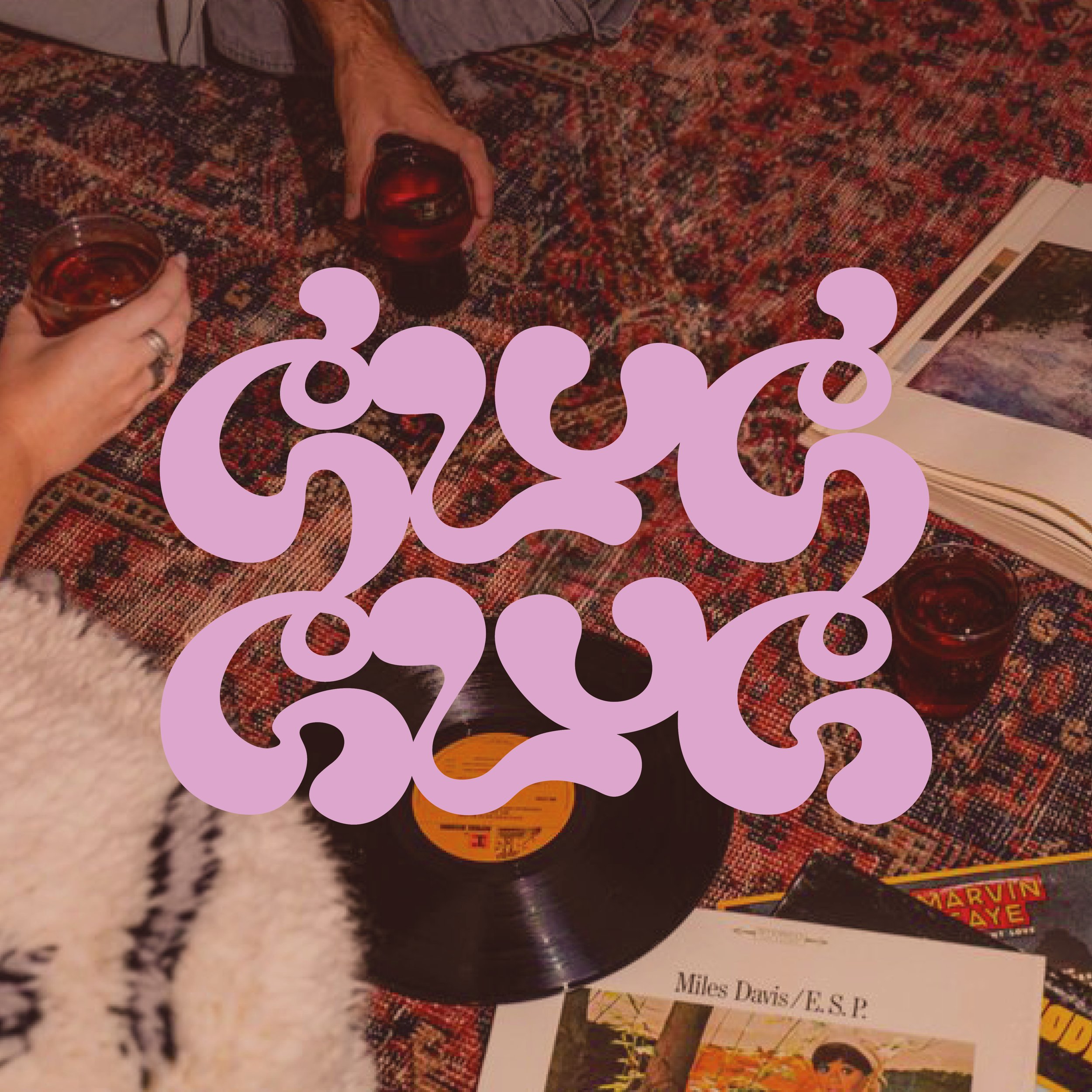
Glug Glug
Brand Identity + Logo Design + Experimental Typography
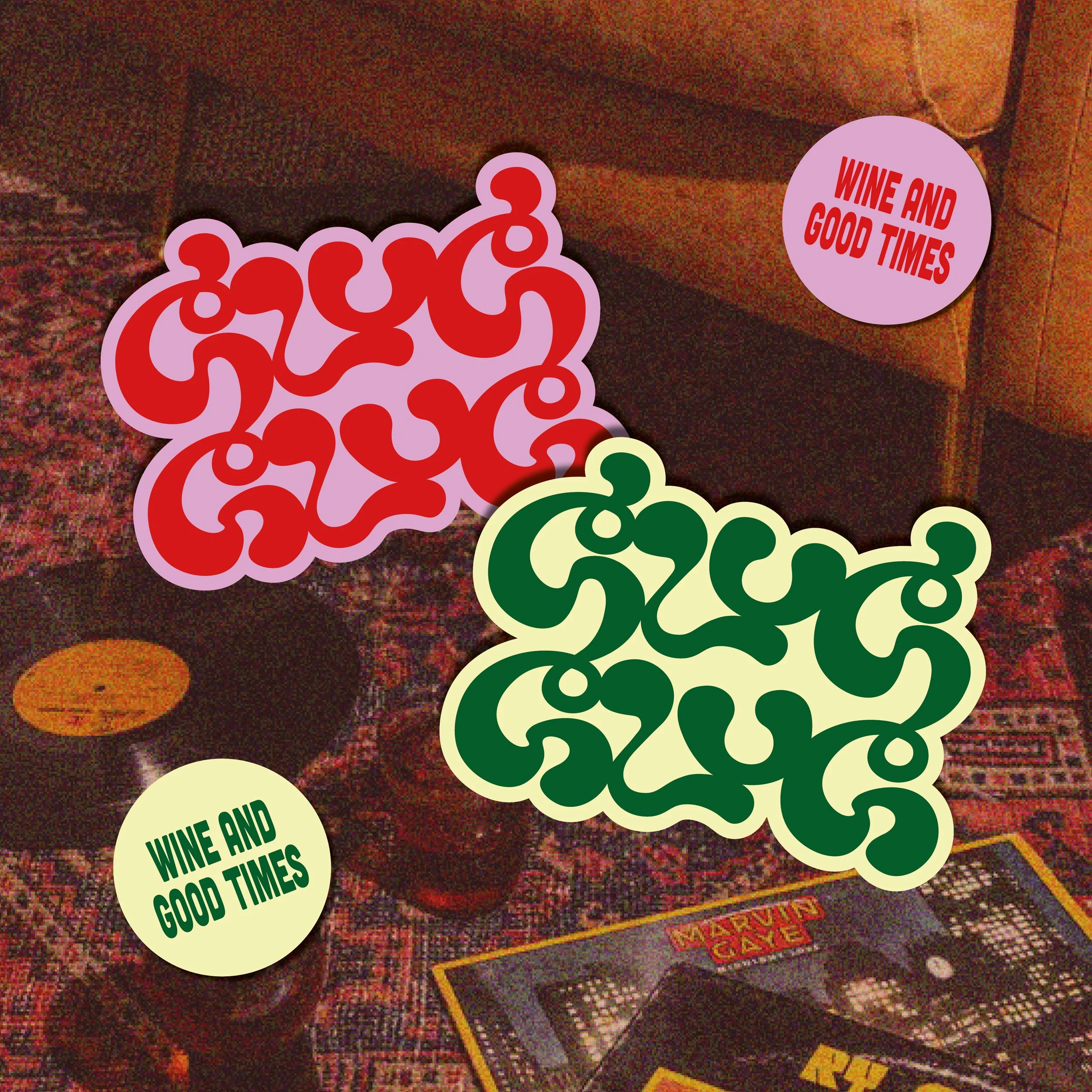
“Wine and Good Times”
‘Glou Glou’ is a French term for a wine that is easily drinkable. The term representing both the sound of liquid leaving a bottleneck and of the rapid gulping of said liquid. The term mimics the English words - Glug Glug.
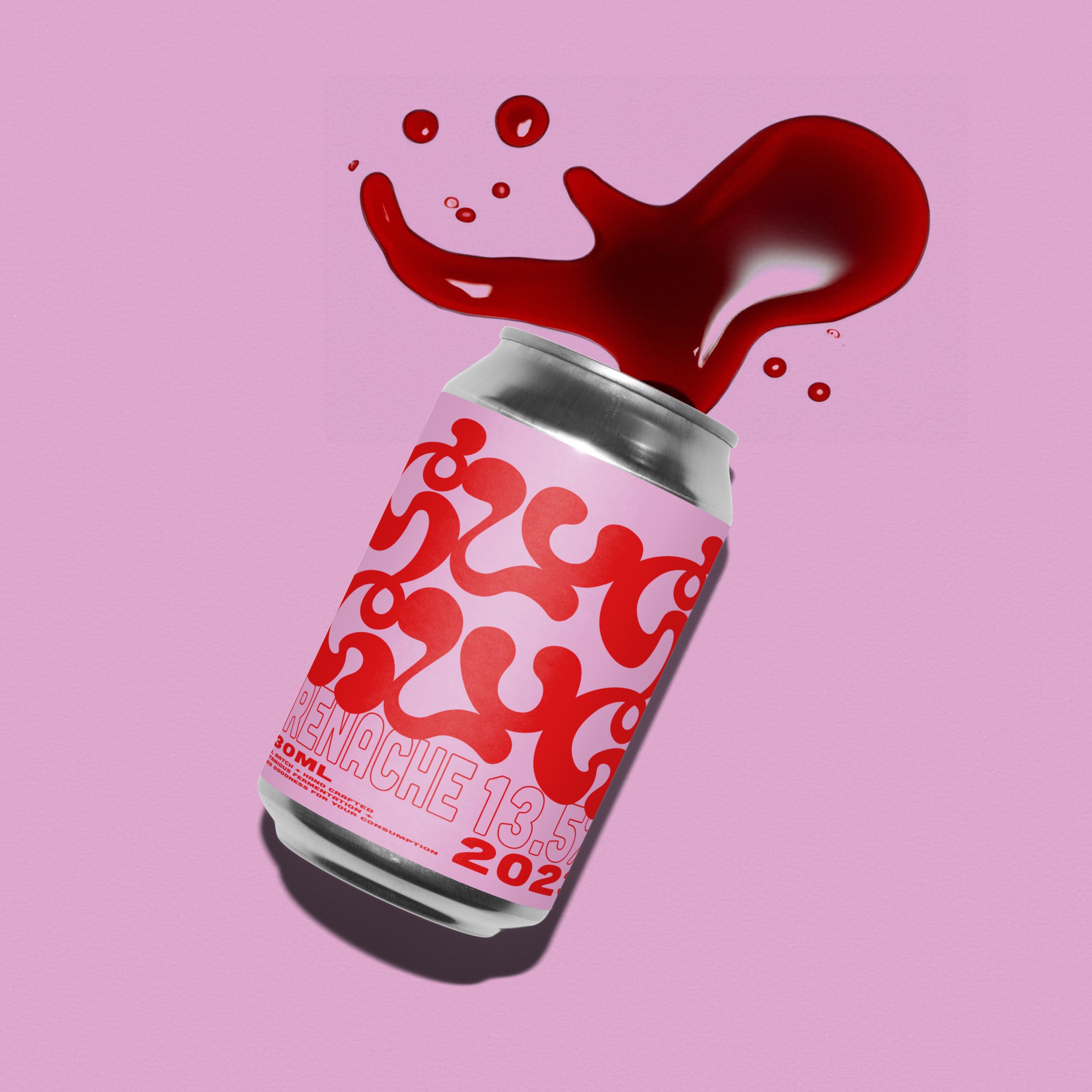
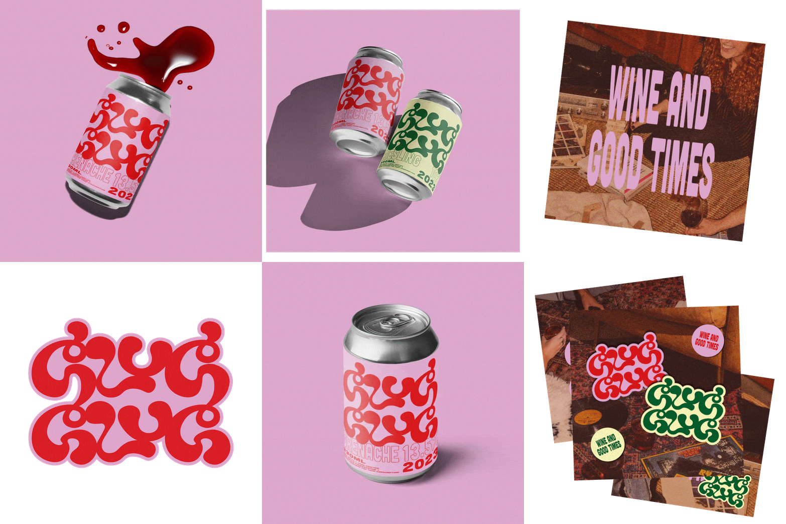
Breaking away from the traditional wine aesthetic, Glug Glug is canned for a laid back approach to drinking some good grapes.
Went to town on some hand drawn typography for this one, really pleased with the end result!
Glug Glug Logo
Marketed as a relaxed approach to drinking good wine. Glug Glug targets those who buy their wine based on looks, lacking extensive knowledge of what kinds of wine they enjoy drinking but have a keen eye for packaging.
With that in mind I sketched multiple ideas of possible logos, honing in on a playful style that would capture a larger audience.
You can read more about Glug Glug on my blog, delving deeper into what makes a good brand.


